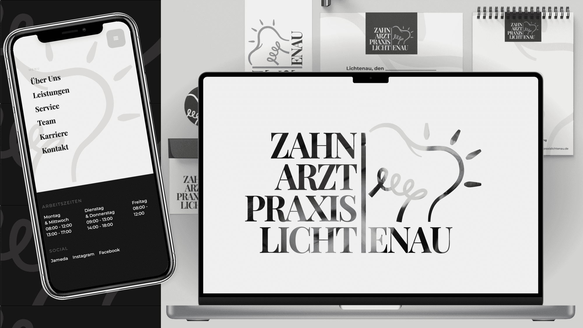
Zahnarztpraxis Lichtenau
A complete rebranding for a generational change — from a dated presence to a modern practice.
Overview
01 —At a Glance
A young dentist takes over a long-established practice from an older colleague and faces a delicate dual task: he has to keep the existing patients who trusted the former owner, and at the same time win new, younger patients. The existing presence was dated and bore the full handwriting of the predecessor.
My task was a rebranding that builds exactly this bridge. I developed the complete new identity, from naming to logo, colours and typography, all the way to the website, the business cards, flyers and the waiting-room videos. The result is a unified, modern presence that, according to the practice, brings significantly more contact requests than ever before.
02 —The Starting Point
Dr. Noor Sheikh Yosef approached me personally. He had taken over an existing practice from an older dentist and wanted a genuine fresh start: something new, something modern that suits him as the younger practice owner.
A decisive detail for the entire direction of the project: he was no stranger to the patients. He had already worked in this practice as a treating dentist, it simply had not belonged to him yet. Many patients therefore already knew and valued him personally before he greeted them as the owner. This very circumstance later became the emotional pivot of the rebranding.
The practice did already have a website, but it was heavily dated and still breathed the predecessor’s style entirely. That was not enough for a credible generational change. It needed a presence that feels modern without scaring off the established regular clientele.
Particularly exciting: there was not even a finished brand name yet. The identity truly had to begin from zero.
03 —The Challenge
The central tension of this project was a balancing act between two audiences with opposing needs:
- Existing patients already knew the practice and the new owner from his time as a treating dentist. They must not feel unsettled by the modernisation; on the contrary, the existing trust in the person had to transfer to the new owner and the new practice.
- New patients, especially younger ones, should become aware of the practice in the first place through a modern, professional presence and feel encouraged to book an appointment.
A rebranding therefore had to reassure and excite at the same time. And it had to make one very practical leap: before the takeover, appointments could only be arranged by phone, a real barrier for many people.
04 —My Role
This was a true end-to-end project. I was responsible for the entire visual and digital identity of the practice:
Naming and branding
name finding, logo, colour world and typography, the complete brand from the ground up.
Web concept, UX/UI and build
structure, user guidance and design of the website, implemented in Webflow.
SEO
extensive search engine optimisation so that the practice can be found by new patients at all.
business cards and posters in the new look.
Video
editing of the waiting-room videos.
The copy was created in close coordination between me and the dentist. A dedicated photo shoot was originally planned (I photograph myself too), but it did not come about, so professional imagery from an external photographer was integrated into the design.
05 —Concept and Design Decisions
Radically Reduced
Mr Yosef wanted an emphatically minimalist, plain and clean look: modern, calm, high quality. I achieved this through a reduced colour world of a warm off-white and a soft, slightly greyish black. This restraint works in two ways at once: it radiates the calm and cleanliness one wishes for from a dental practice, and it feels contemporary without being fashionably short-lived.
How robust this foundation is shows in the fact that the practice lives the branding far beyond the website: the team outfits (white trousers and a dark grey shirt with logo, for example) now echo the brand colours. A logo commission thus became a consistent, unified appearance that the practice simply did not have before.
Trust From the First Second
The most important conceptual decision concerns the moment directly after the hero section. Exactly where most practice websites immediately launch into services, I deliberately placed a personal section:
A photo of the dentist, a personal, direct address to the patients and, as the decisive detail, his handwritten signature beneath it. This combination makes the presence immediately human, genuine and approachable. Instead of an anonymous practice, you are greeted by a person who says: “I am here now, and I will take time for you.”
This is precisely what solves the project’s core challenge: because the patients already knew him from his time as a treating dentist, the personal address connects exactly there, turning the familiar face into the familiar owner. Existing patients immediately sense that they remain in good hands, and new patients build trust before they have read a single service. The personal signature lends the whole an aesthetic, credible and personal note.
From “Phone Only” to Reachable
A central functional advance concerns reachability. Via the new website, patients can now get in touch directly, briefly describe their concern and ask for a callback. That is a much lower barrier, especially for people who are reluctant to pick up the phone.
We deliberately did not yet implement full online appointment booking: after the takeover, renovation and other costs were the owner’s priority at first, so we kept the scope deliberately lean and economical. Online booking is already planned as the next expansion step (see “Outlook”).
Creating Visibility
A modern presence is of little use if no one finds it. That is why SEO was an integral part of the project: through targeted search engine optimisation I made sure that new patients can discover the practice online at all. This is a decisive building block for growing beyond the existing patient base.
Digital visibility is complemented by social media: with the new logo and the unified visual language, the practice is now also actively present on platforms like Instagram and Facebook, to reach new patients and bond more closely with existing ones.
06 —The Design System
All these decisions are captured in a design system that keeps the presence consistent across every channel. A reduced, editorial system built on monochrome photography, a classic serif and a clean grotesque.
Brand Core
Trust, calm and warmth, expressed through an editorial, almost magazine-like visual language. The brand combines the matter-of-factness of modern dentistry with a human, inviting attitude. Core idea: the smile as the emotional centre.
Colour World
The palette is deliberately reduced and monochrome. We deliberately chose the light direction, matching the branding concept of light, relief and brightness that derives from the dentist’s first name.
Ink / Brand Black
#191717
Dark sections, footer, primary button, body text
Paper / Off-White
#F1EFEF
Main background, light text on dark
Pure White
#FFFFFF
Cards, social tiles, panels
Warm Ivory
#FAF9F5
Subtle surface gradation
Muted Grey
#707070
Secondary text, meta, labels, text links
Line Grey
#D3D3D3
Dividers, decorative line art
True Black
#000000
Icons, maximum contrast
Typography
A classic pairing: an expressive serif for emotion, a clean grotesque for structure.
Zahnarztpraxis Lichtenau
Playfair Display
Serif → headlines, quotes, emotional statements
Ein Neuanfang zum Anfassen
Montserrat
Sans → UI, body text, labels, buttons, navigation
Signature detail: a handwritten signature beneath the personal welcome text brings a closeness and authenticity that no font can achieve.
Form Language
The form language thrives on the contrast between strictly geometric UI elements and organic, hand-drawn brand elements. Softly rounded corners, generous white space, clear vertical rhythms and a recurring line-art motif (a stylised tooth plus sun plus playful loops) as a graphic signature. Diagonal image cuts loosen up the rigour.
Layout Pattern
A centred, calm and airy grid with clearly separated sections alternating between light and dark. With plenty of white space between the blocks.
Components
Few, consistently repeated building blocks instead of many one-off solutions per section.
Voice and Tone
Warm, personal, reassuring, with a wink. Direct address, clear short sentences, always patient-centred.
Results and Impact
07 —Results and Impact
- Significantly more contact requests: according to the practice, many enquiries come in via the website since the relaunch, far more than before, when the phone was the only option. The new, low-barrier contact option is actively used by people.
- A consistent brand image: an inconsistent, dated presence became a coherent identity, from the website through print to the team’s clothing.
- Improved findability: thanks to the SEO measures, the practice is more visible online to new patients.
- A satisfied client who actively lives the new appearance across all channels.
08 —Client Testimonial
Taking over an existing dental practice brings countless challenges. The biggest hurdle for me was communicating this fresh start cleanly, modernly and at the same time respectfully. With Ipek Moosheimer at my side, this project became a complete success. She not only conceived the website but also developed the complete branding including the logo. What impressed me most was her advisory strength. She guided me through every single decision in a structured way. We used to be reachable only by phone; today we receive messages easily by email directly through the website. That noticeably relieves my team. Without Ipek’s creative vision I would never have mastered this milestone so professionally. Anyone looking for a designer who thinks along, advises strategically and brings brand identities to life is in the best hands with Ipek.
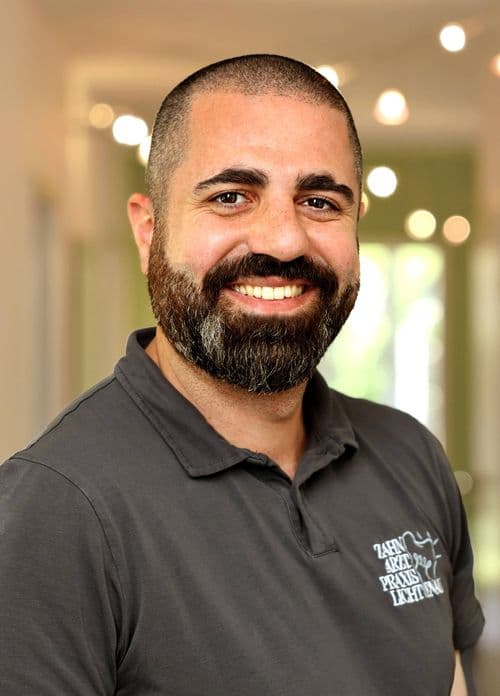
Dr. Noor Sheikh Yosef
Inhaber der Zahnarztpraxis Lichtenau
09 —Outlook
The next expansion step is full online appointment booking, extending the already simplified contact path into a seamless digital booking experience.