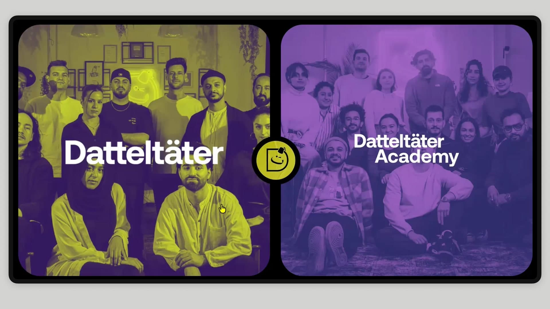
Datteltäter
Two opposing brand worlds — professional film production and a young creator academy — united in one website without either diluting the other. Result: the first fully digital online application platform for the ARD/ZDF funk format Datteltäter.
Overview
01 —At a Glance
Datteltäter came to me with a task for which there was no internal idea yet: two target groups, two tonalities, two design worlds — but only one website. On top of that, an application process so cumbersome that it lost potential talent along the way.
My answer: a selection screen as the entry point, a toggle built right into the logo for switching between the two worlds, and an online form that made it possible to apply entirely on the site for the first time. The result: many applications right on time for the new season, and a process that became noticeably easier for applicants and the screening team alike.
02 —The Starting Point
At that point, two strands stood behind the format:
- Datteltäter GmbH: the professional production side. It needed to appear serious and competent to partners and sponsors.
- Datteltäter Academy: the talent programme. It needed to appeal to young, creative people and win them over for joint projects.
The client was very certain about one thing: both worlds should keep their independent character. So what was needed wasn’t a common denominator that waters both down, but a structure in which both come fully into their own. What that could look like was open. Closing exactly this conceptual gap was my real brief.
There was also a deadline: the Academy page had to be ready in time for the coming season, because applications were to be actively collected. That made the website not an image project, but a recruiting tool with a deadline.
03 —The Challenge
Two questions had to be answered at the same time.
1. How do you bring two opposing brands onto one website? Without one world visually overwhelming the other, without visitors losing track of which side they’re currently on, and without the switch becoming a slippery slope.
2. Why does almost no one apply? A quick look at the existing process was enough for the diagnosis. Anyone who wanted to apply had to leave the website, download a document, fill it in, save it again and then compose a separate email. Every one of these steps is a hurdle where people drop off. Many gave up out of frustration before they were even finished.
For the design, that meant: it wasn’t enough to integrate the Academy nicely. The process itself had to move away from the download form and toward a direct online application.
04 —Approach & Collaboration
In terms of design and concept I worked solo, but in terms of content the project was closely interlinked with the client from the start. I had fixed contacts at Datteltäter with whom I continuously coordinated the concept and from whom imagery and content came. Younes Al-Amayra reviewed the drafts and helped define the direction.
With a client without a clear target vision, transparency is the most important tool. Instead of presenting finished facts, I regularly showed status and options and made decisions together. That built trust and ensured that the final concept was genuinely supported in the end.
05 —The Idea: Separate, but Connected
Several drafts and stylistic directions were up for discussion. In dialogue with the client, a solution made up of three building blocks emerged.
1. The Selection Screen
Instead of throwing visitors straight into one of the two worlds, a calm switch greets them first: the Datteltäter side on the left, the Academy on the right. This positions both as equal and independent from the very first second.
2. Two Independent Worlds
After the choice, you find yourself on a completely normal website with its own style, its own tonality and its own subpages. The GmbH side presents itself professionally and partner-oriented, the Academy young, creative and inviting.
3. The Logo Toggle
The key trick: via the logo in the top left, you can switch between the two worlds at any time. No clunky extra menu item, no confusing dropdown. The element that already stands for brand identity becomes the switch between the identities. The separation stays clear, yet the switch is always just one click away.
06 —The Centrepiece: Online Applications
The functional core of the Academy page is the application form. Emerging talents enter their details directly on the page and upload their own content and materials right along with it. Done.
This moved a scattered, manual process onto a central, structured platform. Applicants do everything in one place in a clear flow; the team at Datteltäter receives applications in a uniform format and can review them significantly faster.
07 —Implementation
At the client’s request, I built the website in Wix and was equally responsible for concept and technical implementation. The two independent worlds, including the toggle logic, ran smoothly. I work confidently with website-builder and no-code platforms and bring experience from tools like Webflow, so that even more demanding interaction concepts can be cleanly implemented within the respective platform.
In addition to the structure, I brought the site to life with targeted interactions and motion, so that both worlds feel lively and high-quality.
08 —Design System
Brand Core
Overall mood: confident, young, migrant-empowering, editorial — somewhere between streetwear and literary magazine. The tone is playful and human: informal address, emojis allowed, micro-copy with a wink („This area is still boiling ;)", „sag SALAAM!").
Colours
- Lime as the Academy’s signal colour. Deliberately used sparingly: logo, one accent per screen, hover states. Never as a full area, so the colour keeps its impact.
- Light sections as a calm base for text and content.
- Dark sections as contrast areas that emphasise the editorial feel and set the rhythm of the page.
Typography
Two type worlds in interplay:
- Serif display for headlines. It brings attitude and the editorial magazine character.
- Geometric sans for everything else. It keeps body text, navigation and the form clear and calm.
The contrast between the two creates tension without becoming loud.
Shapes and Textures
- Key visual homepage: the layout is based on two monitors standing side by side — a direct metaphor for the medium of video that Datteltäter and the Academy work with every day.
- Rounded corners: they give the interface a charming CRT-television flair.
- Tactile textures: no flat background. Light sections sit on crumpled paper, dark ones on scratched film and grunge grain. This gives the site warmth and a handwritten feel.
09 —Results & Impact
The website delivered exactly what it was built for:
- Many applications came in via the new online platform, right on time for the season that triggered the project.
- Consistently positive feedback: the process ran more easily for everyone involved than in previous years, for applicants and the screening team alike.
- Uncertainty became clarity: „we don’t know how to bring this together" turned into a working website with a navigation concept that the client supported and approved.
10 —Client Testimonial
Working with Ipek was genuinely pleasant. She quickly grasped our brand and goals — she didn’t just execute what she was told, she thought alongside us and brought her own clever ideas. We had a tricky challenge: uniting two very different worlds under one roof. She handled it confidently from concept through design to the finished site. What makes her special: creative thinking that is nonetheless structured and considered. She delivers not just beautiful, but meaningful. Highly recommended.
Younes Al-Amayra
Regisseur & Gründer, Datteltäter
11 —Reflection
For me, this project is a good example of how the most valuable design work often happens before the first pixel. The real achievement wasn’t the pretty interface, but solving a structural problem the client couldn’t yet grasp, and finding an answer for it that feels self-evident in hindsight. Just as important was the close collaboration: taking someone by the hand through an unclear starting point is at least as decisive as the design itself.
12 —Note on the Current Status
The website is no longer online today, as Datteltäter is not continuing the Academy. The concept, design and the functioning application platform remain unaffected by this. The screenshots and recordings show the final state of the website at the time it was live.