LMWY
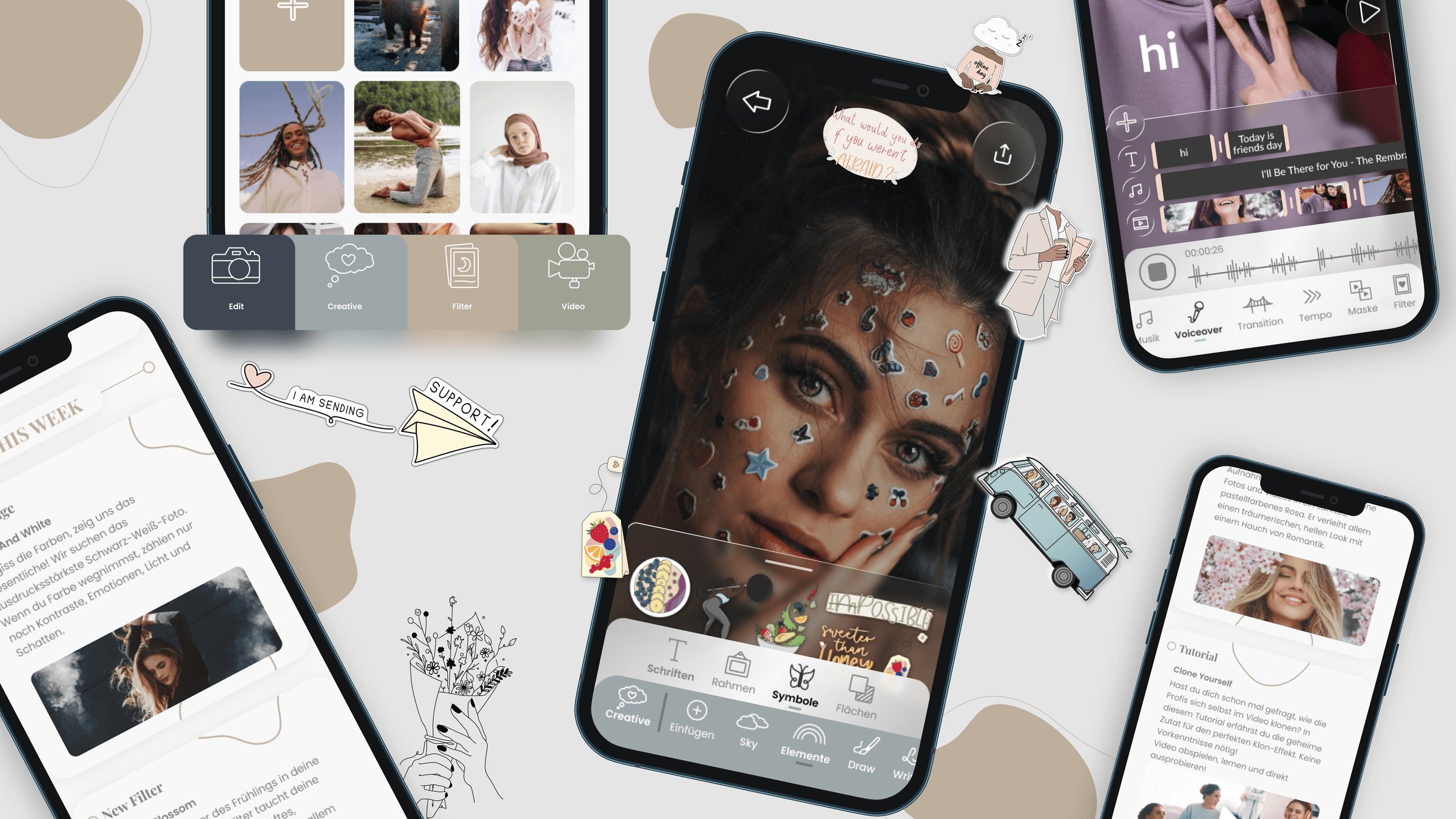
UX/UI concept and complete brand identity for an all-in-one content creator app — built from scratch. The branding now carries the entire LMWY brand: app, shop, website and printed journal.
Overview
01 —At a Glance
Lisa-Marie Schiffner, a content creator, knew the problem from her own experience. For every step of content creation — editing, planning, posting and sharing — she needed a different app. Her vision was a single platform that unites everything. There was a clear idea and a list of features. Everything in between was missing: how do you turn this into a product you can operate intuitively, and what does the brand even look like?
That was exactly my task. I developed the complete UX/UI for the LMWY app, from the entire user flow down to every click path, and created the brand identity from scratch: logo, colours and typography. This branding lives today not just in the app, but carries the entire LMWY brand — from the online shop to the website to the printed journal.
02 —The Starting Point
Lisa-Marie came to me with a strong, personally motivated vision: an all-in-one creator app that unites photo and video editing, content planning and a community platform in one place. The idea grew out of her own everyday life as a creator and out of the frustration of constantly jumping back and forth between individual specialised apps.
From this daily experience she knew very precisely what the app should be able to do, and had a fine sense for which functions absolutely had to be included. Concept, idea and even initial sketches already existed. As for visual assets, only the finished icon set existed.
What was missing was the path from this feature list to an actual product. Which function belongs where, what you tap to get where, how the architecture of the app is built — all of that was open. Just as missing was a visual identity: no colour concept, no logo, no design language.
03 —The Challenge
An app that is supposed to do everything is, from a UX perspective, one of the most demanding tasks there is. The larger the feature scope, the higher the risk that a product becomes overloaded and ultimately unusable. The real task therefore lay not in accommodating the functions, but in ordering them: despite their number, they had to feel light and self-explanatory.
On top of that, there was no framework I could have oriented myself on. The structure and appearance of LMWY emerged in parallel, both from scratch. I simultaneously defined how the app is operated and how the brand looks, sounds and feels.
04 —My Role
My area of responsibility was broad and lay at the core of the product:
- UX concept and information architecture: I developed the entire user flow. Which function lives where, what gets tapped to get where, and how users move through the app. Exactly the knowledge that was still missing on the client side is what I contributed.
- UI design: the complete visual interface of the app — clean, user-friendly and designed for a pleasant operation.
- Branding from scratch: logo, colour concept and typography. The entire visual identity of LMWY comes from this project.
The icons themselves were created beforehand by a graphic designer. Their independent visual language gives the app its own charm, which I integrated into the interface.
To be honest, it also belongs here what was not part of my remit: the marketing and the pricing of the app.
05 —The Process
The core of this project was formed by numerous, very personal concept conversations with Lisa-Marie. In them I took in her vision and her feature wishes and translated them step by step into a working product structure. She brought the What, I brought the How.
On this basis, many drafts emerged with different approaches to how the multitude of functions could be arranged sensibly, clearly and intuitively. Iteration by iteration, a user flow grew that tames the feature scope instead of being overrun by it.
Four Areas, One Logic
A central building block from the early concept phase was dividing the app into four clearly separated areas: Edit, Creative, Filter and Video. In each area you carry out a different task, and each area has its own colour. This way users orient themselves immediately and always know where they are.
Each area brings its own tools. The structure of the tool navigation stays identical everywhere. Once you have understood the operation, you immediately find your way in every area and don’t have to learn anything new. This combination of colour separation and consistent operating logic was the key to keeping the large feature scope manageable.
The community area was conceived as a lively, recurring incentive. The idea: regular challenges through which users can unlock new filters and content. This way a pure tool was meant to become a place you keep returning to.
06 —Naming and Logo
Before there could be a logo, a name was needed, and that wasn’t settled for a long time. Lisa-Marie herself wasn’t yet sure what the app should even be called.
So we played through many directions and tested combinations with the abbreviation LMWY: LMWY Studio, Lab, Home, Space, Universe and several more, accompanied by the slogan „home of creativity". I thought this „Home" concept further and picked it up in first logo and app-icon ideas, for example as a visual allusion to a home for creativity.
In the end, Lisa-Marie deliberately chose the simplest solution: a pure lettering logo from the abbreviation of „Lisa-Marie We You". No addition, no pictorial mark, just the four letters. Exactly this reduction is what makes the logo so viable today. It works on every medium, from the app icon to the shop to the printed journal.
07 —The Design System
So that the app holds together despite its scope, I built a compact, consistent system of colour, typography and design language. It holds all areas together and can be transferred beyond the app to the entire brand.
Colour World
The palette deliberately stays reduced and calm, so that the creators’ content stays in the foreground and the controls hold back.
Sandbeige
#BEAF9C
Lead colour of the brand. Carries headers, primary buttons and accents.
Salbeigrün
#9FA193
Muted, calm counterpole for secondary areas.
Schiefergrau
#404952
Deep contrast for text, dark buttons and the community area.
Off-White
#F8F8F8
Light base area that gives the interface air.
Typography
Two typefaces, clearly separated in their task:
- Playfair Display for all headings. The serifs give the brand something editorial and high-quality that you already recognise in the logo and in the page titles (for example in „Content Planer", „Week Planer" or „Community").
- Poppins for everything else: body text, labels, buttons and navigation. The geometric grotesque keeps the operation clear and modern and forms a deliberate contrast to the playful heading.
Content Planer
Playfair Display
Headings — editorial and high-quality
home of creativity
Poppins
Body text, labels, buttons and navigation
This interplay of elegant serif and clear grotesque is the typographic fingerprint of LMWY and runs today through all media of the brand.
Design Language: Modern, but Playful
The design goal was to keep the app modern and at the same time make it deliberately creative and a little playful, in the interactions as well as in the colouring. LMWY should feel like a creative instrument and not like a sober tool.
At the time of the project, skeuomorphism and the glass look were a big design topic, and the design visibly leans on that. In several places I work with slightly transparent, milkily translucent elements. There are two reasons for this. First, it fits the contemporary look. Second, and this is the more important reason, this keeps the focus on the actual content. When editing a photo or video, the controls lay themselves as a glass layer over the image without stealing its attention. Glass works excellently for exactly this.
On top of that come recurring design principles that give the interface its character:
- Soft, generously rounded cards with gentle shadows as the basic building block of almost all screens.
- Round, glass controls for actions like back, share or search that float on the medium.
- Playful, hand-drawn lines as a detail, for example in the community area, where loose curves connect the individual cards with each other and give the structured layout something human.
- Clear, calm areas of plenty of off-white that leave room for the warm colours and the content.
08 —Collaboration with the Developers
The implementation was handled by external developers whom Lisa-Marie had hired. The collaboration ran entirely remotely. I handed over structured Figma handouts that contained all necessary specifications and interaction logics.
The process ran smoothly, a good example of how well-thought-out, cleanly documented design handovers make the decisive difference, especially in a purely remote team. This clarity in the handover phase ensures that a design really becomes the product that was intended.
09 —The Branding That Became the Whole Brand
The part of this project that is most beautiful to me only revealed its full significance in hindsight.
When I developed the logo, colour world and typography, the brief was to create an identity for the app. Today I see that this branding has long become more. It carries the entire LMWY brand: the online shop, the website and even the printed „Content Planner & Selfcare Journal". From an app identity, the visual foundation of an entire company has emerged, one that keeps growing and builds on this foundation.
For me, that is the most valuable kind of design work: one that endures beyond the original brief and becomes the load-bearing identity of something bigger.
Results and Impact
10 —Results and Impact
- From an unstructured idea came a finished, usable product. The LMWY app went live in the App Store, with the user flow and design language I developed as its foundation.
- The branding today carries the entire brand. Logo, colours and typography, originally developed for the app, now shape the shop, website and print products of LMWY.
- A viable design system of colour world, type pairing and area logic holds the app together and can be transferred beyond it to every medium of the brand.
- A long-term relationship of trust. Lisa-Marie brought me in again and again across several project phases — for the original concept, for an additional feature and for preparing the App Store assets.
11 —Client Testimonial
For an app like LMWY, which combines photo and video editing with content planning, an intuitive user flow is everything. Ipek solved this complex UI/UX design challenge perfectly. The interface is super clean, extremely user-friendly and simply fun. Anyone looking for a designer who combines creative thinking with strong UX structure is in exactly the right place with Ipek! 💪🏻
Lisa-Marie Schiffner
Gründerin von LMWY
12 —Reflection
For me, this project shows exemplarily what good UX design truly delivers: not the adding of functions, but the ordering of complexity. The greatest value creation lay in translating a vision that existed only as a feature list into a clear, usable structure and into an independent brand.
Honestly, a look at the scope also belongs here. As with many products, the app continued to develop independently after my design handover. Some of the early concepts are not implemented in this form in today’s live state, and menu items or design details were added and changed independently. That is the normal course of a living product. My contribution was the foundation: the user flow, the original interface and the brand identity on which LMWY builds to this day.