SYNCPILOT — Digitale Beratung
As a product designer at a B2B hidden champion, I co-designed several interconnected products — live consultation, asynchronous document flows and scheduling — for public authorities, energy providers and health insurers.
Overview
5.5 years of product design for a B2B ecosystem that brings personal consultation and legally binding contract closures into the digital world.
Context: Permanent role as a product designer at SYNCPILOT Group (Augsburg) · Industry: B2B SaaS for Public, Energy, Health, Insurance and more · My work: UX, UI and concept across several interconnected products · Tools: Figma, FigJam, Adobe XD
Note on confidentiality and representation: The products named here and how they work together are publicly documented by the company; internal details and real interfaces are not. This case study therefore stays at the level of concept, approach and decision logic, and cites no operational metrics.
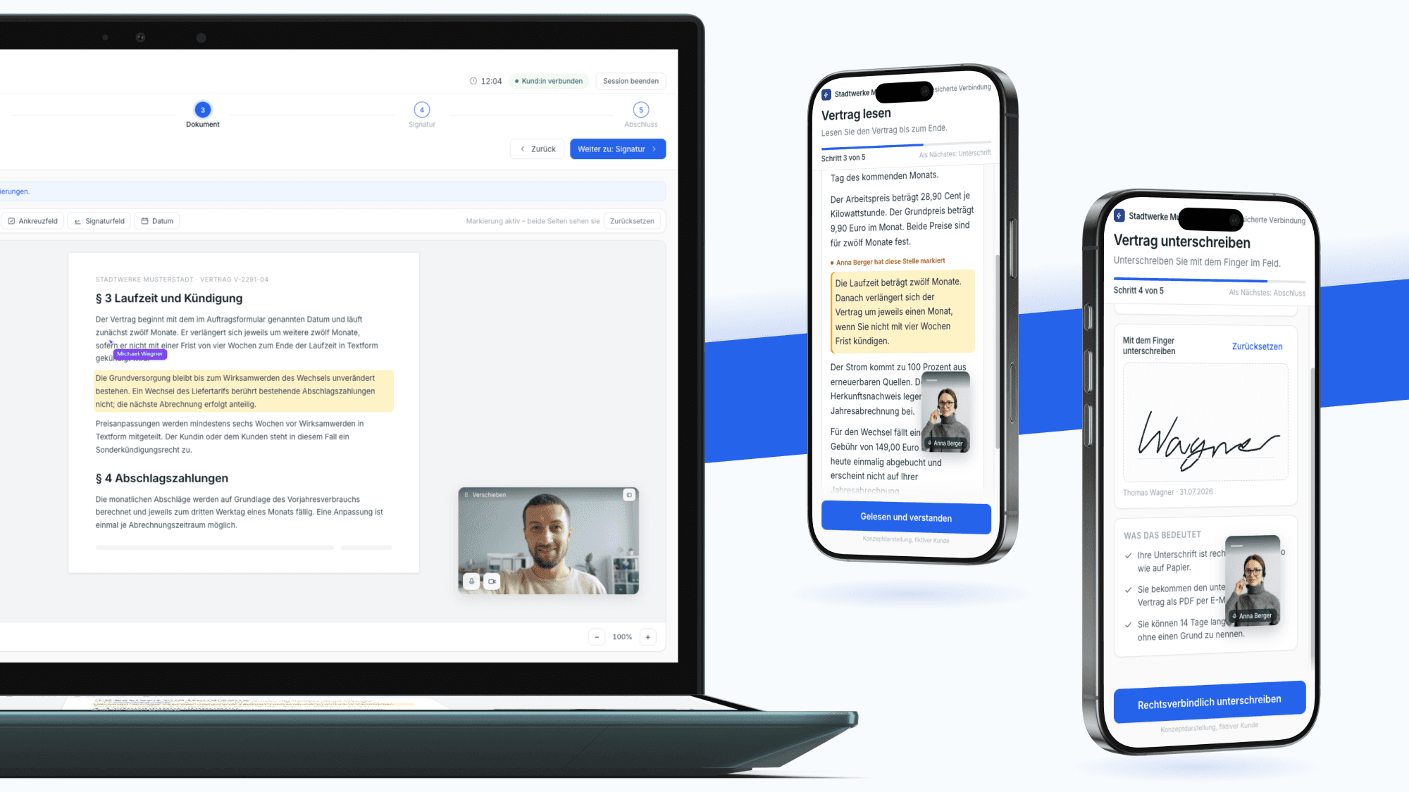
Important for understanding the visuals: in reality, the consultation and closure process described here is spread across several standalone products. There is no single product that maps it from start to finish in one interface. All interfaces shown are representations I designed specifically for this case study, in order to tell the process in one picture, supplemented by a fictional client ("Stadtwerke Musterstadt"). They neither reproduce a real product interface nor a planned one.
01 —At a Glance
How do you close a contract with a public authority, an energy provider or a health insurer without appearing in person, yet still with personal consultation and legally secure? That is exactly what I worked on for almost six years as a UI/UX designer.
This case study is therefore not a single project with a beginning and an end. It shows how I worked within an evolved product ecosystem: several products that serve the same process at different points, two very different user groups within the same transaction, and a regulatory framework that is non-negotiable. Here I describe the common thread I worked on over the years, and the decisions that shaped it.
02 —The Context
Since 2015 the company has digitised consultation-intensive contract closures and services for industries such as Public, Energy, Finance, Healthcare, Insurance, Mobility, Retail, Social Insurance and Telecommunications. The customers are not end consumers but organisations with the highest demands on data protection and legal certainty: ministries, municipalities, energy companies, health insurers and insurance providers. The core product LIVE CONTRACT is, among other things, certified as an SAP endorsed app.
Two peculiarities shape every design decision in this environment:
The paying customer is not the end user. Decisions are made in the specialist department of an authority or utility; the product is used by consultants in day-to-day business and by citizens who see it exactly once in their lives. Anyone who only listens to the requirements list from sales builds past this second group.
The software is multi-tenant. The same interface appears in the branding of a ministry, a health insurer and a municipal utility. Design therefore has to work not just once, but across many colour worlds and with technical terms of varying lengths.
03 —The Challenge
A transaction that in the physical world consists of conversation, a paper document, a signature and payment has to run digitally in a way that feels secure and understandable for both sides and remains legally watertight. From this arise three design requirements:
- Two perspectives in one session. Consultants need a powerful tool with overview, control and several parallel transactions. Clients need a simple, anxiety-free interface that explains itself. Both meet within the same transaction.
- One flow instead of many separate steps. Invitation, waiting area, video consultation, jointly viewing documents, signature (live or asynchronous), payment and closure must feel like one connected path, even though several products stand behind it technically.
- Trust as a design goal. For legally binding closures, perceived security is not a nice-to-have. Every step must show what is happening right now, who is involved and what comes next.
04 —My Role
I co-designed UX and UI across several products and developed concepts for new features and product ideas. The arc ranged from rough architecture and first MVP directions as a basis for concept rounds with stakeholders, through to the detailed design of individual flows — always in close coordination with engineering and product.
Specifically, I worked on these publicly documented product areas:
Live consultation (LIVE CONTRACT). The real-time session in which consultant and client jointly view, discuss and sign documents, including video, whiteboard interaction and a guided process through to closure.
Asynchronous transactions (SYNCDOX). A task and document flow in which consultants create tasks (read a document, upload, sign) that clients complete independently of time. In principle a document tool with a digital signature.
Scheduling (Booking and Scheduling). Creating appointments and booking slots from which clients book and are guided directly into the appropriate consultation or document track.
On top of this there were further internal product surfaces I cannot talk about here. I consistently received positive feedback for my work on them.
05 —How I Arrived at Decisions
… She never just wanted to deliver screens, but first to really understand the problem. For that she stayed in close exchange with customers and customer-facing stakeholders and consistently brought the feedback back in. With us from product and engineering she discussed as an equal and took our feedback just as seriously as the users'. The result spoke for itself: the users were genuinely thrilled with the new frontend.

Volkan Bulut
Senior AI Product Manager
In an enterprise product for the public sector you cannot just invite ten citizens for a usability test while they close a real contract. Reliable knowledge here comes from other sources, and over the years I drew mainly on four.
The people who talk to customers every day. In a B2B company, support, customer success, consulting and sales are the best permanent source of research. I collected recurring questions and complaints and sorted them by task and role rather than by product. This made visible which points in the flow had to be explained again and again. Anything that has to be explained regularly is a design problem, not a training question.
Observing real workflows. Demos, pilot phases and coordination with the specialist departments of client organisations show how consultants actually work: with several open transactions, under time pressure, often with a phone call in parallel. These observations revealed more about the necessary information density in the consultant interface than any feature list.
The regulatory framework as a research object. Requirements for electronic signatures, data protection and accessibility are not a side condition in this environment but source material. I read them early and translated them into design consequences, for example: if traceability is legally required, the status of a transaction must be visible to both sides and not only sit in the log.
Looking outward. Video conferencing and signature tools set the expectations citizens bring with them, even if they technically do something else. Government solutions, in turn, can map complex processes but are rarely pleasant to use. Our solution had to sit between these two poles: the predictability of consumer tools with the depth of administrative software.
06 —Decisions
A Shared Framework for Both Sides
Decision. The flow is guided on both sides by the same step logic, visible as a named current step together with what comes next.
Why. Both parties must be able to give the same answer to the question "Where are we right now?" at any time. Without this shared framework, consultants moderate the flow verbally and every session runs differently.
The price. Less freedom for experienced consultants who like to jump between steps. This calls for deliberate exceptions rather than an open system.
Density for Some, Calm for Others
Decision. The consultant side may be dense; the client side shows exactly one task per moment.
Why. Consultants use the tool daily and benefit from overview. Citizens see it once and lose confidence with every additional option. A single unified interface would have disadvantaged both groups.
The price. Two interfaces with shared building blocks but different logic. That costs more maintenance and demands clear rules about which component appears where and how.
Asynchronous Is Not a Fallback Plan
Decision. The asynchronous path via tasks and documents is an equal path into which a live session can transition at any time.
Why. In practice, closures rarely fail for lack of willingness, but for lack of documents or time. If a transaction breaks off at this point instead of turning into tasks, everything starts over.
The price. The state of a transaction becomes more complex because it can sit in different stages over several days. That first had to be made cleanly representable in the consultant dashboard.
07 —Iterations
In this environment concepts are rarely right on the first draft, because feedback comes from three directions at once: domain, technology and law. Two examples of how designs changed as a result.
From a tile grid to a prioritised list. An early version of the consultant dashboard showed all open transactions as equal tiles. In conversation with practitioners it turned out that the real question is not "What is open?" but "What is up next?". The grid became a list sorted by urgency, in which waiting or most recently handled transactions always sit at the top.
From a fixed video window to a flexible, controllable one. In the first versions the other party's video sat in a fixed position. A pattern emerged from the feedback of client organisations: at certain moments of the consultation the image gets in the way, because it covers exactly the spot that matters.
In a legally binding situation, the other party's face is an anchor of trust. Once you click it away, you negotiate the rest of the transaction with an anonymous interface. Neither the consultant nor the client wants that.
We therefore implemented the window so that it can be moved freely across the surface and, when needed, docked to the sidebar, where it stays small and unobtrusively present. The person never disappears entirely; they only step back.
Why I show this example. The real requirement was not "get rid of it" but control over one's own workspace. In my experience that is exactly the difference between a feature request and the need behind it. Anyone who implements the request literally solves the symptom and, in passing, loses something no one had explicitly asked for.
08 —One Process, Spread Across Several Products
From the client's point of view this is a single transaction. From the software's point of view it is several: a scheduling system, a live consultation platform and a document centre that works both standalone and as an extension of the consultation platform. That is precisely where the real task lay. Not in designing one interface, but in the transitions between them.
Simplified and abstracted, the flow looks like this: a prospect arrives in a digital waiting area via a booked appointment or as a spontaneous request. The consultant sees everyone waiting in their dashboard, already knows the context from the calendar for scheduled cases, and brings the person into the session. There the actual transaction unfolds: view documents together, pay if needed, sign (live or as an asynchronously assigned task) and close.
Every jump between these products is a moment where trust can be lost: a new interface, a new link, sometimes a new sender in the inbox. Making it invisible to the client side that several systems are working together here was one of the recurring questions of my work.
The Shared Foundation
For several products to feel like one, they need the same building blocks. For this I built the design system that all products share: components, patterns and the rules for when which element is used.
It solved two things that had previously been renegotiated every time. Within the design team there was a shared basis, so that designs for different products did not drift apart. And in the handover to engineering, discussions about spacing and states became a reference both sides could point to. Precisely with a multi-tenant application that appears in the branding of many organisations, this is exactly where it is decided what may be variable and what may not.
More on this in a dedicated case study: SYNCPILOT Design System: a foundation for several products
The Process Imagined in One View
Because a flow that runs across several products is hard to show, I played it through in one continuous interface for this case study: one session, one step framework, and behind it the same functional stations. This is expressly my own representation and not a product, neither an existing nor a planned one. Its value lies in making visible what clients should ideally notice nothing of: that several systems mesh together here.
09 —What Happens When Things Don't Run Smoothly
The straight-line flow is the rarer case. A large part of my work lay in the states beside it: the client doesn't show up for the appointment. The connection drops during signing. A document is missing. The payment fails. The consultant has to hand the transaction over to a colleague.
For legally binding processes this is not a footnote, because each of these states must be unambiguous, traceable and free of data loss for both sides. I captured these cases systematically as a state matrix instead of resolving them one by one in the ticket history.
10 —Impact
- A shared language for the process. The flow model became the reference in discussions between product, engineering and sales. Instead of talking about individual features, people talked about points in the process.
- Concepts as a basis for decisions. MVP directions and architecture sketches turned stakeholder rounds from an exchange of opinions into selection decisions.
- Reusable patterns. Waiting moments, status display and task logic were treated the same across product boundaries, which made new features faster to decide on.
- Recognition for new product surfaces. I received positive internal feedback for the interface of the as-yet-unreleased AI-supported product.
I cannot cite operational figures from the client projects. What I can describe is the impact in the product and in the team.
11 —What This Work Shows
Alongside the freelance projects in my portfolio, this case study stands for a different side of my work: regulated enterprise product design in a team, over five years and across several products, under real conditions with data protection, legal certainty and system integrations such as SAP. What counts here is not the striking surface, but structured thinking in systems, deriving decisions from indirect sources of insight, and the ability to bring two very different user groups together in one process.
… In the design she placed enormous value on taking our hands-on experience from system administration into account, which made the usability of our products take a huge leap. She completely broke down the barriers between departments and motivated her whole team to approach us just as openly. …
Dominik Hornstein
System Administrator
12 —Reflection
The art in this kind of software lies in making complexity invisible. Someone completing a registration online or closing a contract should notice nothing of the orchestration of video, documents, signature, payment and system integrations, but instead feel well-guided. Almost six years on this kind of problem have sharpened my sense of how to make large, regulated systems human. And they taught me that trust in the interface almost always arises from the same two things: saying what is happening right now, and saying what comes next.