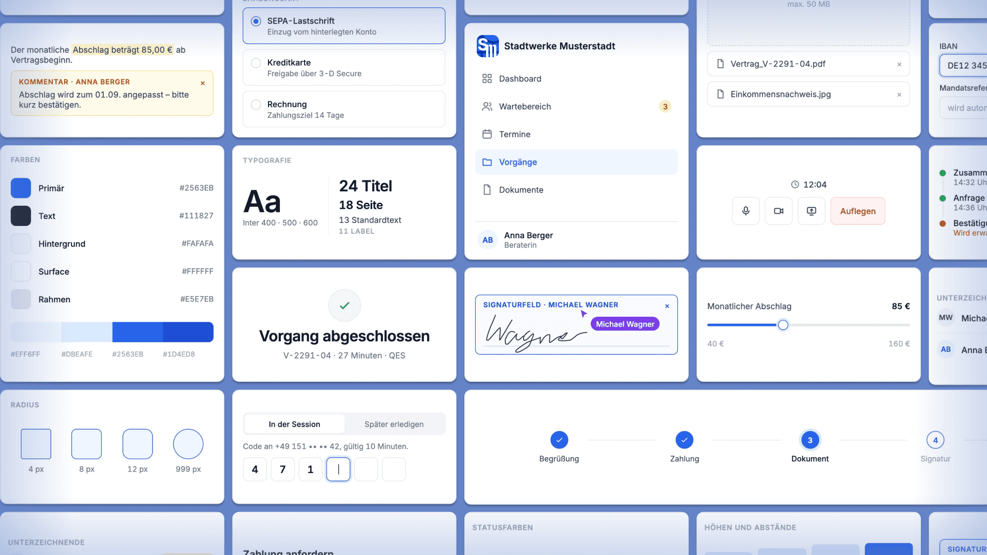
Design System: ein Fundament für sieben Produkte
Leading a design system that grew over five and a half years, survived a tool change, carried seven products, served two opposing user groups, allowed third-party branding and passed an external accessibility audit.
Overview
A foundation for multiple products.
Role Product designer, lead for the design system · Scope From the agency handover to the external accessibility audit · Period 2021 to 2026 · Extent Around 60 components, seven products and numerous services, a design team of four
Confidentiality: I cannot show the internal documentation and the real library. All visuals are newly created, abstracted representations. The product side of this work has its own case study: 3 products, 1 process.
01 —Context and Challenge
When I started there was no design problem, but a translation problem. For the redesign of the main product, an agency had delivered beautiful concept screens and a handful of base components: two buttons, a card, a sidebar and a header. You can present with that, but you cannot build anything. The developers asked more and more questions the screens gave no answer to. What happens on click? What does the error case look like? What if the text is longer?
That is exactly what I was hired for, as the company's first UI/UX designer.
The starting point in detail
The product was to be rebuilt with Angular. Concept, architecture and navigation remained essentially in place; changes came in from customer feedback, along with a requirement that had never been met before: the product should finally work on mobile too.
What I found:
- Concept screens without states, without behaviour descriptions, without rules
- Very few components, already diverging in colour from the old legacy system
- Developers who ran into a gap with every implementation question
- No one in the company who could answer these questions permanently
The brief was framed practically: expand components, resolve open questions, create new concepts. That this had to become a system emerged from the work itself. The same questions kept coming up, only in different places.
02 —Building the System
Over five and a half years this grew into a system for seven products and numerous services: around 60 components, a complete set of fundamentals and about a dozen documented patterns. At times I worked on two to three products simultaneously, which meant constant context switching and was at the same time the reason I was the only one who could see where the same question was answered differently across products.
I initiated the switch from Adobe XD to Figma internally and advocated for it over a long period, then led the rebuild of the library. The system survived this tool change and grew from one designer to a team of three UI/UX designers and one UI/UX manager.
From Adobe XD to Figma
Phase one: one designer, one product, Adobe XD. I took over the agency building blocks and extended them, with Zeplin as the handover to development. Back then the system existed mainly in my head and in the file. I documented sporadically, because the resources for more were not there. In parallel the other products emerged, and so a product library became a system question.
Phase two: Figma and a team. My arguments for the switch came from everyday work: a central library, real collaboration on one file, a cleaner handover. It was decided when two more designers joined. We did not import the existing stock but rebuilt it, with Auto Layout and variants, and kept the fundamentals in a central library via variables and styles. One practical hurdle: Figma had no folder structure back then. Instead we worked with one project per subcategory.
The difference between the levels is the difference between "what does it look like" and "when do you use it". The second question costs more time in everyday work, which is why it received the larger share of the documentation.
The library itself is built on Atomic Design, from the smallest building blocks through composed elements to finished blocks. From this arise two roles we deliberately separated: base building blocks from which new things can be assembled, and finished building blocks that are ready to use directly. For development, exactly this separation was important, because it answers the question of whether you should combine a case yourself or whether an approved solution already exists.
Fundamentals: Accessibility, colour system, layout, elevation with shadows, hover and theming, shapes, typography, iconography, motion, writing.
Patterns: Buttons, cards, dialogs, disabled states, empty states, icon states, layout, notifications, tables, tooltips, upload, text fields, forms, high-contrast mode.
03 —Decisions
The following three examples show how decisions were made in the system. Every decision comes with what it cost.
Consistently Square Instead of Rounded
Decision. All elements are square; only floating elements are rounded.
Rationale. Our interfaces are tools, and visual density takes priority. Many rounded shapes would have made the products softer and visually more restless across the surface.
The price. Less visual warmth, and a commitment that can only be changed later with great effort.
Documented with an expiry date. The documentation states explicitly that the decision applies to the current product landscape and is to be re-evaluated should the products ever converge into a single application. A recorded decision is only helpful if what it depends on is recorded too.
How the decision came about
I did not pose the question as a matter of opinion but as a spectrum with four positions: everything rounded, system elements rounded and the rest square, only a few exceptions rounded, or consistently square. Each position came with examples from the market, so that the discussion could take place around something visible.
Upload Pattern
Decision. Four upload modes and result displays, chosen by use case rather than by taste.
Rationale. In one product the person wants to keep working after uploading; in another, to see that it worked and immediately swap something. Without a rule this was solved differently in every product.
The price. A pattern you have to read before using the component.
The four modes and the two displays
Modes: Single upload for exactly one file such as a logo or profile picture. Single upload with image preview, when the result has to be checked visually. Single upload without preview for documents such as PDFs. Multiple upload, when files belong to a collection, order matters or metadata is maintained.
Display as a table, when these are business documents that need metadata such as date, type and status, must be editable and persist after the dialog is closed.
Display as a list below the component, when the files are attachments, have hardly any metadata and no one wants to sort them.
On top of this the question of whether the upload happens in a dialog or directly in the interface, with a rule for the behaviour afterwards: does the dialog close after uploading, or does it stay open so the person sees what arrived?
Decision Trees Instead of Discussions
Decision. Recurring questions get a decision tree in the documentation instead of a rule in running text.
Rationale. A rule you have to know; a tree you can walk through. Discussions that used to take half an hour were often settled in two minutes this way.
The price. Trees age faster than principles and have to be maintained.
Two examples
The most-used tree clarifies whether a confirmation happens inline or deserves a dialog. It does not begin with the visuals but with the situation: is the person leaving a flow they will not return to? Is the action hard to reverse? Would a wrong click have serious consequences? Does the input need more than three fields?
A second tree deals with a question that comes up constantly in enterprise software: when may an element be disabled? Disabled elements without explanation are one of the most common sources of frustration, which is why almost every path ends with a requirement for justification, such as a tooltip that says what is missing.
04 —Colour and Accessibility
The hardest decision of the system sits in a conflict of goals: our products are multi-tenant, the client organisations want to set their own colours, and precisely that can destroy contrasts without anyone noticing.
The solution consistently separates variable, non-variable and automatic. The client organisation chooses primary and secondary colour, background and surfaces. Type style and iconography stay fixed. The text colour is calculated from the chosen colour and set to black or white, so that text remains legible regardless of the client's choice.
The hardest part was not the idea but conveying it. A system in which one colour derives from another is unfamiliar to everyone involved. The solution only became viable through documentation and examples, and it emerged exactly where design and engineering did the maths together.
Exceptions and theming
The only deliberate exception to the typography rule was the booking page of the scheduling product, because it addresses the end customers of the client organisation and there may follow their appearance more strongly.
From the same logic came a dedicated rule layer for theming: which component may appear on which surface in which variant, so that hover states and fills are correct even when the element sits on a coloured or itself-reactive background. That sounds like a trifle and was one of the most common error cases.
All of this was created without today's AI tools, that is, through calculation, testing and many attempts.
Externally audited. The main product was built to BITV 2.0 and WCAG 2.1 and audited by Project Alliance. What was tested: keyboard operation via tab navigation, screen reader support, contrasts, and behaviour under zoom and different screen sizes.
For the system this meant a permanent way of working rather than a one-off audit: visibly distinguishable states, focus states as part of the definition and not of the implementation, and a dedicated pattern for a high-contrast mode. The connection to the colour logic is direct. Without the calculated text colour, every client organisation could have unintentionally undermined the contrast values.
05 —Implementation and Collaboration
The system hung on a chain that ran from design all the way to audit. Every station had its own purpose and its own audience.
For implementation there was a technical component overview in which the building blocks were represented and always up to date. This is where development looks things up day to day.
For understanding there was Confluence, built as its own area with fundamentals, style guide, design patterns, components and guides. There sat the fundamentals in detail, the principles, the patterns, the decision trees and above all the why. This level was aimed at stakeholders, product management and the design team, but was also read by development.
One format runs through almost all patterns: Do and Don't side by side, with a real example and a rationale. Not "this is what right looks like", but "this is what wrong looks like, and here is what then happens". That caught more questions up front than any description.
Two Interfaces, One Toolkit
The system serves two very different worlds: the dense tool of the consultants and the reduced view of the clients. The way of working was always the same. First design the consultant side, because that is where the functionality arises, then ask what the client side really needs of it, and leave out the rest.
The most revealing result of this: the client view needed no components of its own. New requirements came without exception from the consultant perspective. The client side is a strict selection from the same toolkit. That was not planned; it turned out to be a pattern and considerably simplified the maintenance of the system.
Iconography: The Invisible Half
We built our own iconography, and the difficulty did not lie in the drawing. Icons that indicate a state have to mean the same thing throughout the whole system. Whether a crossed-out eye means "the content is hidden" or "click here to hide" is not a matter of taste but has to be decided once and kept identical everywhere. For visibility, locking, favouriting and similar cases we defined which symbol shows which state and which action a click triggers.
Why export was the real hurdle
We created the icons in Illustrator and brought them into Figma, but in development problems kept surfacing whose cause lay in the creation: path naming, file structure, export settings. Through trial and error a binding procedure emerged for how icons are to be set up and exported so that they work reliably in implementation. After that, extending the library was routine instead of troubleshooting.
This is one of those things that become visible in no component overview and yet make up a large part of the work on a design system.
With Ipek there was never a standstill in the project. A solution was always found in a pragmatic way. Ipek adapted the design templates to needs and circumstances, and she was always appreciative of feedback from the developers.
Viktor Säubert
Frontend Developer
Bringing the Team Along
As long as I worked alone, the system was a tool. With the team it became a matter of conveying. I presented and justified new rules, because a rule whose reason no one knows is bypassed at the first sign of time pressure.
Both newly joined designers brought in their own principles and patterns, which we sharpened and finalised together. I reviewed their work on the system and did the fine-tuning, because I was the only designer with a view across all products and across the old component system. This responsibility was explicitly intended: my manager entrusted me with the domain leadership of the system.
She built many fundamental structures in the design system. She defined design patterns, documented components and thereby created a very good foundation that optimised the daily work for other designers. In design reviews I could always rely on her feedback.

Sahar Jafarian
Product Experience Designer
06 —Impact
- A shared language. Everyone involved knew what was being talked about. Decisions came faster, because it was clear what had already been decided.
- Shorter discussions. Questions that used to cost half an hour were often settled in two minutes, because someone could point to an existing pattern.
- Audited accessibility. The rules in the system were the basis for the main product passing the external audit.
- Faster onboarding. The newly joined designers could orient themselves around an existing foundation instead of developing their own ways.
07 —What Remained Open
The system was never finished, and I consider that the more interesting insight. The documentation lived on two platforms, linked but not merged. The plan to turn it into a single design system site failed against day-to-day business.
Two things I would do differently today. First, document earlier, even badly. In the early phase many principles existed only in my head, and every later person had to ask for them anew. Second, develop the colour concept together with engineering from the start, instead of designing it and then having it translated. The viable solution emerged exactly where both sides did the maths together.
08 —Why This Work Is Relevant
Building a design system that one person maintains alone is one thing. Building one that grows over five and a half years, survives a tool change, carries seven products, serves two opposing user groups, allows third-party branding and, in doing so, passes an external accessibility audit is another.
A design system is infrastructure. When it is good, no one notices it, and yet how fast and how reliably everyone else can work depends on it. The most valuable design work is often the work that enables others.